Monday, 28 December 2015

Organisation: Location

To ensure that the ethos of the magazine is correct and follows a pattern I have to choose a suitable location to shoot the original photography which I am going to take. As you can see from my drafts the pictures have been taking MCU this means the some background will be seen therefore it has to look profession yet indie. 

'The Custard Factory' in Digbeth feature many indie art pieces which may be suitable for my cover. The street art round the area will be ideal as this shows a 'rebellious' nature to the band. http://www.custardfactory.co.uk/ 

Drama Studio; I have been given permission to use a black box drama studio for my photography. Although plain, the black background and the colour Band may show a contrast therefore make it easily recognizable.

I have also took many other places into consideration which would be ideal for my photography and hopefully can delve deeper into this topic to get the perfect pictures I need. 

Organisation

Influences 

Magazine Influences
I have not have many different influences regarding the actual magazine as I have mainly focused on NME. This is because it is a very similar genre to which I want to base my cover, contents and spread on. I have also done work on different magazine genres such as rock (Kerrang) and Pop ( We Love Pop.) This helped me for ideas on general conventions of magazine.

Artiste Influences
I have focused on bands which NME have decided to zone in on. This is because I am basing my magazine ethos on NME therefore mine would feature similar bands. For this reason I have done research into

  • Foals
  • Swim Deep
  • Arctic Monkeys
  • RATBOY
  • Stone Roses
These are all bands with 4 male members and for this reason my band will have 4 male members.

Organisation

Color Scheme.
I have researched many different indie magazines such as NME and the colour varies a lot, some feature black and white colors other very bright. I have decided to use both colours and black and white. I may include a brightly colored background to show a modern, new style of the magazine and make the picture stand out more. On the other hand I may use a black and white photo on this background to show the old fashioned, classic side of the magazine. Overall I believe the combination of the different colour scheme will make my magazine stand out.

Ethos
Similar to NME my style is Indie Rock, Therefore, I need to ensure that I take this into consideration when taking photos. I will not be taking photos of people wearing stereo typically 'Pop' Clothing and my actors will be shown wearing items such as Leather Jackets and Doc Martins. I believe like bands like Peace and Swim Deep this will fit my ethos well.

Thursday, 24 December 2015

Wednesday, 23 December 2015

Drafting and Planning

This is my first draft of my magazine contents page, I believe I have included features which are very stereotypical and codes and conventions which most magazines have but also things which makes it stand out.

Tuesday, 22 December 2015

Drafting and Planning- First Draft

This is my first draft of my magazine cover. I have included the basic layout which I am aiming for to ensure that my magazine stands out and is recognizable. I am included many different features for my magazine such as Pugs, Puffs and screamers to grab the audiences attention. As this is my first draft I hope to make alterations to the layout to make it the best it can possibly be.


Wednesday, 16 December 2015

Drafting and Planning

I have used a website called Survey Monkey to get questions on my magazine answered anonymously and also by friend and family therefore shared the link to my series of questions on a social media site called Facebook. Hopefully this will help me make choices into what the public want to see in my magazine.

Q1. For this question 9/12 people believed that a weekly publication would be ideAl therefore on my front cover I will include that my magazine is weekly issue to create a realistic feel to the cover.

Q2-This question allowed me to develop my knowledge on which is the most important feature.
6 people believed the Masthead is most important
5 thought the main image took priority
1 person believed the main text would be the most valued.
I will use a variety of techniques to ensure that all 3 stand out and are recognisable.

Q3- This helped me ensure that my cover has realistic features on the front cover. 50% - £2.00
41%- £3.00
9% - £2.50
Due to this information collected I have a price range which I can base my magazines price on.

Q4- 2/3 of people thought that a physical copy of a magazine is the most important therefore I will focus on a physical copy rather than including links to different websites throughout my contents page and double page spread.

Q5- 75% of people thought that the correct amount of pages for mymagazi e would be 21-30 therefore on the cover I will include enough information to ensure that it looks believable and realistic

Q6- As I had already created the name Truth for my magazine  I wanted to see how the public would react to this name for a maG. Luckily, 73% of people agreed that this was a good name.

 - this is a link to my questionnaire questionnaire https://www.surveymonkey.com/analyze/lGsHxHd52QXt4DN347Lw5jjQVyg1ifvH1S81MRuFdDM_3D

Monday, 14 December 2015

Drafting and Planning

My band is going to an indie rock quartet named'          ' and the target audience of my band band will be 14-20 therefore fitting the ethos of the magazine. I will include direct address to make it look like my band want you to buy the magazine. I will include an exclusive interview with the band on my double page spread to show how '      First Album' was a success. My band will be made up of 4 young males as research shows that magazines like NME usually feature male 4 piece bands like the killers, arctic monkey and peace. For the setting of my photo shoot i am going to use either the black box drama studio or my friends garden. I am hoping to capture the lead singer smashing a guitar up. Hopefully my band will capture the style of Truth therefore ensuring that the magazine follows a certain pattern of genres.

Sunday, 13 December 2015

Drafting and Planning

This is my publication plan and it states how I intend to set my magazine cover , contents and double page spread out but also who my magazine is aimed at  and the general genre of my magazine. Hopefully this will give me an idea on how my final product will look.

Friday, 11 December 2015

Drafting and Planning:Peer- Assessment of Remake - Remodel Task

 http://paddyhickey1.blogspot.co.uk/2015/12/research-into-similar-proucts.html 

This is blog post including a task we had to do called remake - remodel where we had to create our own front cover of a magazine. In today's lesson we received feedback from this task which was

Comments
Overall I have a nice sense of proportion and have included some generic features to ensure my magazine cover looks realistic

WWW
I have a nice skyline and the black background with white text contrast well.
I have included different colors which stand out on my plain white background.

EBI
The colors I used were nice but maybe tone down the colouring and include one clear colour and have a set house style for my cover.
Beware of Orphaning my text
It was a bit too simplistic and plain apart from the colors so add more text.

Next Steps 
In my final piece i will have a set target audience so i know the type of content to include on my cover. I will also choose a house style. so that my magazine cover looks professional and less childish

Thursday, 10 December 2015

Drafting and Planning

Such as this magazine cover (https://dianasarkova.files.wordpress.com/2010/02/nme-front-cover4.jpg) I am going to add all the generic features of a magazine Firstly, I will add a screamer to give the audience a feel on  the genre of the magazine.
Next, I will add a Recognisable a left Third so when be shelved it will be easy to recognize and notice which magazine it is.
Thirdly, I am using a masthead so people know which magazine it is
The fourth feature I'm adding is a pug to give people an incentive to buy it.
Next, A barcode will be used to make the cover realistic
I will also Use a main text to show the audience what's inside
A URL will show the audience an online copy of the magazine
Lastly, A skyline will help give a taster to what's in the mag

Hopefully, these features will ensure that my cover is successful

Sunday, 6 December 2015

Organisation

 I will be discussing the ways in which the photography I will he using for my magazine cover, contents page and my double page spread in this blog post. For my photography I want to capture the indie ethos of magazine 'Truth.' THe photography will feature different pictures of my indie four piece band. I will have my band members dressed in black and white as issues of indie mags such NME have their artists posing in black and white such as a bang called Drenge in an issue. I will use direct address and get a band member to look into the camera to make it direct and personal, I will also Use different camera angles such as a high angle to show the power the band have but I may also reverse this to give the audience authority over the band

Saturday, 5 December 2015

Research Into Similar Products


Image result for nme double page spread

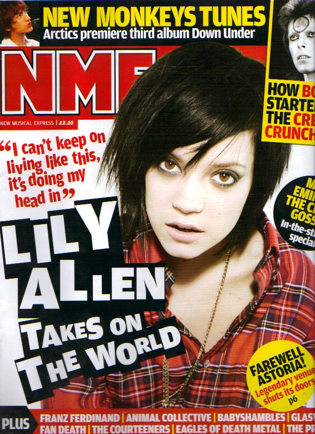
As we can see from this magazine cover and contents page it features Indie Star 'Lily Allen' on both pages. We see her in the same clothing suggesting she did it in one shoot, Therefore when taking my original photography my band members will be wearing the same clothes throughout.  As you can see from the main texts on both pages the text is the same with the black background and white lettering. This is good at it contrasts the original white background making it stand out. This cover also uses direct address in both pages to make you think that she wants you to buy it. The left third is used in a way which they have positioned the masthead in a way which makes people recognize in when on the shelves. A skyline is used to show the other features other than the Lily Allen interview such as ' New Monkeys Tunes' Overall The way in which NME have used the double page spread and cover in twine has been successful and I hope to do that when I release my contents page, Cover and Double Page Spread.

Thursday, 3 December 2015

Drafting and Planning

In this blog post I will be experimenting with different fonts and find out which fonts fit the ethos and general style of my magazine.


Experimental Font-  I believe this font is too childish for my magazine and wouldn't stand out when on the front of a magazine.


 Experimental Font- This font is ideal for my magazine as it is very bold and would stand out when on the front of a magazine.

Experimental Font- Although this font is very bold and would also stand out I believe it doesn't fit the ethos of an indie magazine and would suit a pop magazine much better


 Experimental Font- This font is too tight together and is hard to read when on the front of a magazine with many different fonts and colours


 Experimental Font- This font is too spaced out and would take up the majority of the magazine if I decided to use this font.

 Experimental Font- This font is far too formal for my magazine and would not suit the house style of a magazine like NME


Drafting and Planning; Remake -Remodel Task

This is a magazine cover for NME which we were asked to make using Original photography.

 Firstly, The photo i took i choose to have my friend Josh sit on the floor and look up at the camera as it showed Direct Address and let you know who was going to be in the magazine. Also by him sitting down it gave the audience power and authority over the 'Indie Star'

Secondly,I used a skyline with a black background and white text as they contrast each other but also the brightly coloured magazine therefore making it stand out. The skyline also includes a Puff which gives the reader a reason to buy the magazine.

Thirdly, I included a recognizable Left Third putting the NME in the left corner so people  can see which magazine it is easily.

Fourthly, I included some generic features of magazine such as a URL and a Barcode. I believe this gives the magazine a sense of realism and makes it look professional.

Penultimatly, I used a very colorful main text to show the audience what the artists style was but to also contrast the dark background. In the main text I also used a pun as his name is Josh Vile i believe that this was a successful way to portray my artiste using the main text.

Lastly, I used a screamer, which took the focus of the main text and gave the audience an idea of what else is inside.

Thursday, 26 November 2015

Research Into Similar Products

I have decided to base my magazine on indie ones such as NME, Therefore I have decided to use a 4 piece boy band like Peace and Arctic Monkeys and my target audience it teens and young adults (15-21). I going to follow the usual codes and conventions of an indie magazine therefore i will use some of the techniques used in this magazine and hopefully set out mine so it looks professional:The features on this magazine front cover are:

  • Recognizable Left Third
  • Skyline 
  • Main Text
  • Puff
  • Pug
  • Screamer
  • Direct Address
  • Secondary Picture 
  • bar-code
  • URL
  • Price 
  • Date Line 

I Hope to use all these features in my magazine to ensure that its successful.


Wednesday, 25 November 2015

Research Into Similar Products


Today I am going o talk about how this issue of NME uses many different features to ensure that not only is their magazine noticeable but that it also entices the reader.

Firstly, A recognizable Left Third is used so when shelved, the public can easy notice the mag due to the famous red 'NME' masthead.

Secondly,A Pug is used to give the audience a reason to buy it

Next, Main Text is used the grab the readers attention and immediately let them know who/what is going to be in the magazine. Behind the main text 'Radio head' There is a rainbow running across the cover of the magazine this is a pun because the artistes new album at the time was called 'In Rainbows'

Fourthly, Direct Address is used on the main picture to make the target audience think that he wants you to buy the magazine.

.Lastly, A Puff is used to catch the readers eye when looking at the magazine.

Research Into Similar Products

This is a front cover from the well known magazine NME it uses many features to engage the target audience. A blue background is used and all 6 artists on the front cover are seen in either black or white. This is used to show a very basic side of them but also to contrast the blue and make them 'come out the page. This front cover is full on Indie Stars on the front cover to cover a large audience and if people spot one of there favorite artists on the front it will engage them therefore by including 4 different artists it allows people to choose on which bit of the magazine which they want to read about. A recognizable left third is used so that when shelved people can easily recognize which magazine it is even with the unusually colored background.  Overall this is a successful magazine cover as it features all the codes and conventions such as bar codes and a Main text to make it recognizable.

Tuesday, 24 November 2015

Research Into Similar Products

In this blog post i am going to be taking about genre crossovers and Band Name ideas. As you can see from this cover it features Rap Star Jay Z on the front of Indie Mag NME this is an example of genre crossovers as we can clearly see 2 genres being portrayed. As a fan of both types of music i am hoping to incoperate both Hip Hop and Indie music in my mag. One of the main ways i Can do this is though my band name. I put a variety of things into a Rap/Indie Band Name generator and these are the example which it came up with. Im hoping to use one of these names in my final piece
  1. Throughout Black
  2. Black Nelson Of The Gaming Test
  3. Gruesome Black And The Geek
  4. Black Sound
  5. Black Box
  6. Love Bath
  7. Love Of The Vessel
  8. Sway Love
  9. Impossible Love And The Residential
  10. Democratic Love

Friday, 20 November 2015

Research Into Similar Products

This is a copy of NME and features famous band 'Blur' on the front cover, I shows them in a variety of poses all using direct address to engage you and make you think that they want you to buy it. Unlike most NME magazines the left third isn't recognizable as the Masthead is placed in the center. A bright yellow background is used to contrast the bands clothing and make their facial expressions more noticeable and come off the page a bit more. There is a wide range of colors used to make the mag stand out when being sold and also to make the band stand out in their bland clothing  A rhetorical question is used in the screamer to make you think about the magazine in more detail, A Puff "Classic Interviews" is used to leave you in suspense about who the interview is with.
Overall I believe that the magazine has been successful with its features and i would like for my magazine to be of a similar quality to this using the same techniques and genres. 

Thursday, 19 November 2015

Research into similar products

From my blog post regarding questionnaires I have decided to conduct a separate one regarding the types of magazines people would like to see. I asked 20 people how often they read magazines and what genre. I asked this question to people of 16/17 years of age and the answers were:
18% don't read magazines
35% read pop magazine
40% read indie magazines 
7% read rnb magazines

With 6/20 people reading the genre of magazine I will base mine on I believe that the indie genre is ideal for my target audience therefore my final decision is that I will make an indie magazine with a target audience of young adults

Research into Similar Products


This magazine cover is from the well known mag, NME. the magazine features Pete Doherty in a close up to suggest he is interacting with the reader to try and convince him to buy the mag so we can see why he is on the cover of the magazine. The mag has a clearly recognizable left third as you can see the NME sign. It features a popular indie singer from the Libertines. This is one of my favorite bands and i am going to use similar bands when creating my magazine because I am exploring the indie culture. As well as a popular artist the editor uses a pug to draw in the reader and give them a reason to buy it as they may think that they will get something out of spending their money.