 After much consideration i have chosen to go for the indie genre of magazine as appose to the RnB Style i was thinking about. I thinks this magazine is best suited to me as i can do research into magazines i enjoy and also believe that the ideas for pictures i have in mind will suit this genre well. As you can see from my previous blog post i annotated a Rock Magazine and i am showing the contrast between the Rock and Indie Magazines and how they use the same feature to engage their audience. Firstly, Direct Address is used in a similar way expect this time lots of music stars feature, this is showing off to their audience how much it contains and gives you a lot of information on who/what the magazine is going to be about just from pictures on the front cover. Secondly, The Left Third is very eye catching and the standard colours of NME are recognizable and the Logo is in the top left corner therefore everyone can see it. The Screamer 'PLUS! FALLOUT BOY' is wrote in bright yellow which contrasts the dark background making it stand out more. Lastly, the Pug 'Free HMV discount Card' is in the left third so people see it and also contrasts the dark background with different shapes and colours
Tuesday, 27 October 2015
Research Into Similar Products
After much consideration i have chosen to go for the indie genre of magazine as appose to the RnB Style i was thinking about. I thinks this magazine is best suited to me as i can do research into magazines i enjoy and also believe that the ideas for pictures i have in mind will suit this genre well. As you can see from my previous blog post i annotated a Rock Magazine and i am showing the contrast between the Rock and Indie Magazines and how they use the same feature to engage their audience. Firstly, Direct Address is used in a similar way expect this time lots of music stars feature, this is showing off to their audience how much it contains and gives you a lot of information on who/what the magazine is going to be about just from pictures on the front cover. Secondly, The Left Third is very eye catching and the standard colours of NME are recognizable and the Logo is in the top left corner therefore everyone can see it. The Screamer 'PLUS! FALLOUT BOY' is wrote in bright yellow which contrasts the dark background making it stand out more. Lastly, the Pug 'Free HMV discount Card' is in the left third so people see it and also contrasts the dark background with different shapes and colours

Research Into Similar Products
 This a magazine cover called Kerrang, The usual genre of this magazine is 'Rock.' This is fairly similar to the indie genre although many of the features on this magazine are different to a standard indie magazine such as NME. Firstly they use similar ideas to grab the audiences attention such as a MCU with has been used here to engage you and make you think that the rock star on the front wants you to buy it (Direct Address.) Secondly, the left third is very noticeable due to the usual text of the magazine and the KE of kerrang. The Pug '7 Day Rock Guide' engages you and helps incise you to buy it as you get something free with it. Fourthly the Screamer "This is really scary" is a quote from someone unknown therefore makes you want to buy it as you can see whats scary.
This Four things along with many other techniques have been used to keep the audience engaged and ensure that they buy the magazine.
Monday, 19 October 2015
Research Into Similar Products
 After some consideration i think i am going to choose the Indie Rock Genre for my magazine cover although i still may do a Hip Hop and Indie Rock Crossover. If i decide to go for the Indie magazine i will base it on NME. I believe that magazine covers such as these are not only recognizable but also look very intriguing on shop shelves. As you can see from this cover, One Band (Peace) are the focus the picture is a MCU/Wide shot this is to emphasize their facial expressions and the dark background helps highlight the fact that Peace are on the front cover due to the Big Bold writing on the dark plain background. The left third is also very recognizable due to the NME therefore as i have done 'Research Into Similar Products' I will put my masthead in the top Left corner to grab peoples attention
Research Into Similar Products
This is a very stereotypical magazine for Pop Music, the target audience of this magazine is young teenage girls therefore the house style is very childish and has bold pink lettering making it stand out for basic reasons, This is very different to the magazine cover i want to go for. As you can see the one on the right is much more dark and mysterious and creates a feel of it being very spontaneous. The lack of colour apart from the masthead and main text has a very different approach to the bright colorful 'I Love Pop' magazine


Similarities
- Focus on Main Text
- Recognizable Left Third
- Masthead is easy to spot
- Puff Included
- Intriguing Screamer
Differences
- Amount of Color
- Amount of Pictures
- Quotes
- Focus on different things
Sunday, 18 October 2015
Research Into Similar Products

This is an NME magazine with one of my favorite Hip- Hop Artist 'Tyler The Creator' on the front. AS you can see from my previous posts they feature both Hip-Hop and Indie rock. This cover incorporates the 2 together and shows a 'coming together' of the genres. This is very much what I want to portray in my magazine cover. Although I don't like the house style of this particular magazine a believe that the text is very confusing with white lettering on his white t-shirt, On the other hand I think this is a very creative magazine cover and the way in which they portray the 'Rap Star' is not very stereotypical and doesn't follow the usual codes and conventions of a Indie or Hip Hop magazine. Overall this is very similar to the cover i want to achieve and incorporate the 2 genres (Genre Crossover)
Friday, 16 October 2015
Research and Planning into Similar Products
 I am aiming for my magazine to be like NME, I like the style of 'Indie Rock' therefore this magazine cover is the perfect demonstration for what i want to do, As you can see it feature a band called 'The Libertines' on the front cover. They come under the Genre Indie Rock along with bands such as;
- Arctic Monkeys
- Peace
- FIDLAR
- Palma Violets
- Peace
- Jamie T
- RATBOY
- Swim Deep
On the other hand, I may choose to base my magazine on the genre 'Hip Hop' which the magazine XXL has chosen. As you can see from the cover it is very different to the NME cover and follows the usual codes and conventions of a Hip Hop Magazine. Artist similar to this are;
- Kendrick Lamar
- Tyler The Creator
- NWA
- Tupac
- A$AP MOB
- BBK
- Skepta
- JME
- Kanye West


Thursday, 15 October 2015

Friday, 9 October 2015
Preliminary Task

 This is my Preliminary Task and we were asked to make a cover and contents page for a school magazine. Firstly I used a program called Paint.Net and transferred the basic covers i made as a JPEG file into the Publisher File to ensure I could add different text boxes and fonts to make it a presentable magazine. I used a medium close up and photos from the school website and added a masthead and story line.
Thursday, 8 October 2015
‘Research into Similar Products’

The Left Third is very easy to spot, This is due to the red and white XXl and you can easily tell that's its XXl if you you only saw the left third
The Masthead does follow the usual codes and conventions of XXI regarding the colour and font of the masthead
High Key Lighting is used to highlight his facial expressions and pull you in and make you feel his emotions
Direct Address is used to encourage you to buy it and make you think that he wants you to buy it
The rest of the usually things included like Selling Line, Puffs, Pugs and Screamers aren't included as this is a very simplistic cover and they want you to focus on A$AP ROCKY s that's who this edition is based on.

Colour Scheme
The colour scheme to this magazine is fairly simplistic and follows the usual codes and conventions of an XXL magazine contents page. As you can see its has a red white and black colour scheme. This contents page follows this and can clearly be directed round the magazine due to basic house style and the way things are positioned (The Left Third). Overall this contents page contents page is very good and engaging.
Layout
The layout of this contents page is quite simplistic and only includes the basic necessary information that a contents page would include. This is the usual style of a XXL magazine, This is very popular as i can see where everything is down the left third unlike NME which spread things all across their page occasionally making it hard to read.
Photography
This contents page challenges the usual conventions of a magazine cover as they usually have about 2+ pictures at medium close up where as this contents page has 1 picture as a wide shot. This is because they want you to know Chris Brown is the main focus. We cant see his face as that leaves us in suspense on who it is and only if you read on you will find that out therefore engaging you.

This is a magazine cover from XXL it features a rapper called Rick Ross on one side. In this picture his is holding a bottle of champagne and has white balloons in the background, This could be a indication that he is celebrating something showing that he is famous and doing well for him self and also shows the money he has.This font technique on the other page may have been used on the page to create a sense of uniqueness and style showing that he is unique and doesn't follow trends. Overall I believe that this is a very good magazine cover and shows us a glimpse of life as a rapper.
‘Research into Similar Products’
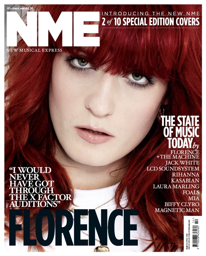
The Left Third is easy to spot on shelves due to the famous Red and White NME that people can easily recognize.
The Selling line is in white with is a good contrast to her red hair and follows the magazine colour scheme
The Masthead does follow the usual codes and conventions of NME and stands out well.
The Puff 'Special Edition Covers' is good as it pulls you in and engages you to buy it.
The Screamer 'I would never of got though the x factor auditors' accompanies the simplistic main text nicely and contrast it in terms of colours.
High Key Lighting is used to highlight her facial expressions and pull you in.
Direct Address is used to encourage you to buy it and make you think that she wants you to buy it

Colour Scheme
This is a contents page from a magazine called 'NME' the cover scheme for this magazine is red white and black and this contents page follows the layout perfectly. You can clearly see the text and the white contrasts the black and the red therefore the white background running throughout makes it clear and easy to read. This contents page also features a slight bit of yellow as does most NME contents pages this is to grab attention as it is unusual and doesn't follow the colour scheme.
Layout
The layout of this contents page is quite simplistic, It is the same as any other NME page as they are all almost identical this is done so people can easily recognize that its there magazine. It is done in such a manner using headlines and sub headlines to ensure that people can navigate round and know what pages to go to when looking for something e.g. a certain band
Photography This is a contents page from a magazine called 'NME' the cover scheme for this magazine is red white and black and this contents page follows the layout perfectly. You can clearly see the text and the white contrasts the black and the red therefore the white background running throughout makes it clear and easy to read. This contents page also features a slight bit of yellow as does most NME contents pages this is to grab attention as it is unusual and doesn't follow the colour scheme.
Layout
The layout of this contents page is quite simplistic, It is the same as any other NME page as they are all almost identical this is done so people can easily recognize that its there magazine. It is done in such a manner using headlines and sub headlines to ensure that people can navigate round and know what pages to go to when looking for something e.g. a certain band
Once again there is only one photograph this is to grab the audiences attention as it links into the main text (Kasabian) as its a photo of them as there is only one photo it grabs attention and as it is quite far away so you can see 2 members of the band it intrigues you as you want to pick it up and see who it is
.

This a double page spread from NME and features an article on Libertines Lead Singer 'Pete Doherty' it shows a picture of him on one side of the magazine as a mid shot, This is good because you can see his facial expressions and also the fact the main text says 'I'm In Good Health yet he is holding a beer is quite ironic 'this double page spread also doesn't follow the usual codes and conventions of a NME page spread as the colour scheme isn't red therefore stating that The Libertines are unusual and don't follow the rules, the colour orange also connotes energy and balance therefore links in nicely to the Headline "IN GOOD HEALTH". On the other side of the spread we can see another small picture with features guitarist Carl Barat this pulls you in and breaks the text up well. There is also a very large quote in the middle of text. This is because this is what you will first read therefore you want to find out what the quote is about. Other than that the magazine is fairly simplistic and follows the basic rules and normality's of a NME magazine double page spread.
Friday, 2 October 2015
Drafting & Planning: Investing Typography
In today's lesson we learnt about 'Typography' I believe its very useful and from this task i think i have developed my skills and now know how certain fonts can fit a magazine style/ethos. Original Order
 Original Order
E
B
F
A
C
D
A.
From 'A'we can see that it is pretty basic and the text doesn't match the ethos of urban yet chic of the magazine. It does not stand out and catch my attention therefore it ranks: 4th
B.
Personally, I think that B is quite a good font to use for this magazine. The bold, vibrant text is very fitting for the type of magazine that i believe Vibes would produce. Overall i think this text, with its spaced out lettering, is clear to see and understand therefore it ranks : 2nd
C.
Comic Sans its the text used for C. I strongly believe that this text is very basic and should not be used for as magazine with the ethos that 'Vibes' has. It is very simplistic and does not stand out. It cant been seen from distance and although professional, it does not suit this magazine therefore it ranks: 5th
D.
This font is the worst font on the page in my opinion. It cant be seen from a distance and for a main cover line it is no where near the right text/size. It is too formal for a magazine such as Vibes and does not follow the usual conventions which that magazine would hold. Therefore it ranks:6th
E.
Second to last, This font has to be the best out of the 6. It is bold and stands out it immediately grabs my attention and can see it from a distance. Overall it is the best as it follows the house style and can easily distinguish the text. Therefore it ranks 1st.
F.
This font is not awful but also not great. It is not the first thing to grab my attention but it may be argued that it ok. Overall this font is not ideal for the magazine as it is basic & simplistic
Subscribe to:
Posts (Atom)