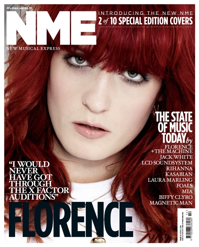
The Left Third is easy to spot on shelves due to the famous Red and White NME that people can easily recognize.
The Selling line is in white with is a good contrast to her red hair and follows the magazine colour scheme
The Masthead does follow the usual codes and conventions of NME and stands out well.
The Puff 'Special Edition Covers' is good as it pulls you in and engages you to buy it.
The Screamer 'I would never of got though the x factor auditors' accompanies the simplistic main text nicely and contrast it in terms of colours.
High Key Lighting is used to highlight her facial expressions and pull you in.
Direct Address is used to encourage you to buy it and make you think that she wants you to buy it

Colour Scheme
This is a contents page from a magazine called 'NME' the cover scheme for this magazine is red white and black and this contents page follows the layout perfectly. You can clearly see the text and the white contrasts the black and the red therefore the white background running throughout makes it clear and easy to read. This contents page also features a slight bit of yellow as does most NME contents pages this is to grab attention as it is unusual and doesn't follow the colour scheme.
Layout
The layout of this contents page is quite simplistic, It is the same as any other NME page as they are all almost identical this is done so people can easily recognize that its there magazine. It is done in such a manner using headlines and sub headlines to ensure that people can navigate round and know what pages to go to when looking for something e.g. a certain band
Photography This is a contents page from a magazine called 'NME' the cover scheme for this magazine is red white and black and this contents page follows the layout perfectly. You can clearly see the text and the white contrasts the black and the red therefore the white background running throughout makes it clear and easy to read. This contents page also features a slight bit of yellow as does most NME contents pages this is to grab attention as it is unusual and doesn't follow the colour scheme.
Layout
The layout of this contents page is quite simplistic, It is the same as any other NME page as they are all almost identical this is done so people can easily recognize that its there magazine. It is done in such a manner using headlines and sub headlines to ensure that people can navigate round and know what pages to go to when looking for something e.g. a certain band
Once again there is only one photograph this is to grab the audiences attention as it links into the main text (Kasabian) as its a photo of them as there is only one photo it grabs attention and as it is quite far away so you can see 2 members of the band it intrigues you as you want to pick it up and see who it is
.

This a double page spread from NME and features an article on Libertines Lead Singer 'Pete Doherty' it shows a picture of him on one side of the magazine as a mid shot, This is good because you can see his facial expressions and also the fact the main text says 'I'm In Good Health yet he is holding a beer is quite ironic 'this double page spread also doesn't follow the usual codes and conventions of a NME page spread as the colour scheme isn't red therefore stating that The Libertines are unusual and don't follow the rules, the colour orange also connotes energy and balance therefore links in nicely to the Headline "IN GOOD HEALTH". On the other side of the spread we can see another small picture with features guitarist Carl Barat this pulls you in and breaks the text up well. There is also a very large quote in the middle of text. This is because this is what you will first read therefore you want to find out what the quote is about. Other than that the magazine is fairly simplistic and follows the basic rules and normality's of a NME magazine double page spread.

No comments:
Post a Comment